Web Design
Wormhole Seafood
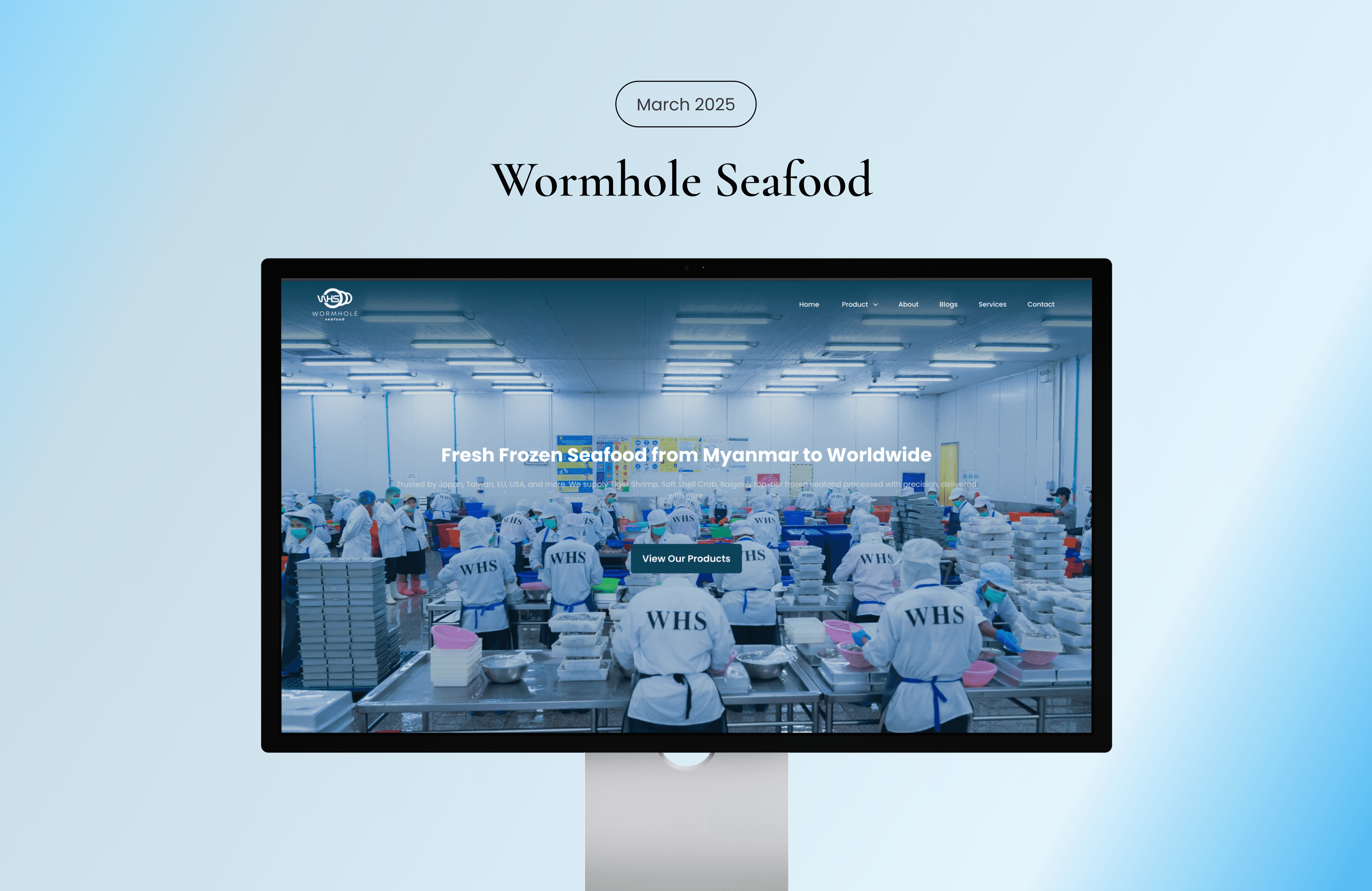
Wormhole Seafood is a seafood distribution company specializing in supplying high-quality seafood products. The website was designed to strengthen their digital presence, showcase product categories, and communicate reliability to business partners and customers.
Year :
2024
Industry :
Food
Client :
Wormhole Seafood
Project Duration :
2 months
Problem :
The company required a professional website that could clearly present its seafood offerings and build trust with distributors, suppliers, and potential clients. Without a strong digital platform, it was difficult to communicate product quality, sourcing standards, and company credibility.
Additionally, the brand needed a structured way to display multiple product categories without overwhelming users.
Solution :
I designed a clean and structured corporate website that highlights product variety while maintaining clarity and professionalism. The information architecture was simplified to allow users to easily explore categories, understand company background, and make inquiries.
The experience focuses on:
Clear product categorization
Strong visual emphasis on seafood quality
Professional brand presentation
Simple contact and inquiry process
Research :
The research focused on understanding user expectations, industry standards, and competitor positioning within the seafood distribution market. Target users such as restaurant owners, wholesalers, and distributors prioritize freshness, reliability, and efficient product access. Competitive analysis revealed that many industry websites suffer from cluttered layouts and weak content hierarchy, creating an opportunity to improve clarity and professionalism. Insights showed that strong visual presentation, structured product categorization, and a streamlined inquiry process are essential to building trust and supporting B2B decision-making.

Challenge :
One challenge was organizing multiple seafood categories in a way that felt clean rather than cluttered. This required careful layout planning and consistent visual hierarchy.
Another challenge was communicating freshness and quality digitally. High-impact imagery and balanced spacing were used to emphasize product appeal while maintaining a corporate tone.
Visual Direction :
The visual style reflects freshness, reliability, and professionalism. A clean layout with strong imagery and structured grids enhances readability and product focus.
Cool-toned colors and clear typography were used to support the seafood theme while maintaining a modern corporate aesthetic.


More Projects


Web Design
Wormhole Seafood
Wormhole Seafood is a seafood distribution company specializing in supplying high-quality seafood products. The website was designed to strengthen their digital presence, showcase product categories, and communicate reliability to business partners and customers.
Year :
2024
Industry :
Food
Client :
Wormhole Seafood
Project Duration :
2 months
Problem :
The company required a professional website that could clearly present its seafood offerings and build trust with distributors, suppliers, and potential clients. Without a strong digital platform, it was difficult to communicate product quality, sourcing standards, and company credibility.
Additionally, the brand needed a structured way to display multiple product categories without overwhelming users.
Solution :
I designed a clean and structured corporate website that highlights product variety while maintaining clarity and professionalism. The information architecture was simplified to allow users to easily explore categories, understand company background, and make inquiries.
The experience focuses on:
Clear product categorization
Strong visual emphasis on seafood quality
Professional brand presentation
Simple contact and inquiry process
Research :
The research focused on understanding user expectations, industry standards, and competitor positioning within the seafood distribution market. Target users such as restaurant owners, wholesalers, and distributors prioritize freshness, reliability, and efficient product access. Competitive analysis revealed that many industry websites suffer from cluttered layouts and weak content hierarchy, creating an opportunity to improve clarity and professionalism. Insights showed that strong visual presentation, structured product categorization, and a streamlined inquiry process are essential to building trust and supporting B2B decision-making.
Challenge :
One challenge was organizing multiple seafood categories in a way that felt clean rather than cluttered. This required careful layout planning and consistent visual hierarchy.
Another challenge was communicating freshness and quality digitally. High-impact imagery and balanced spacing were used to emphasize product appeal while maintaining a corporate tone.
Visual Direction :
The visual style reflects freshness, reliability, and professionalism. A clean layout with strong imagery and structured grids enhances readability and product focus.
Cool-toned colors and clear typography were used to support the seafood theme while maintaining a modern corporate aesthetic.
More Projects
Web Design
Wormhole Seafood
Wormhole Seafood is a seafood distribution company specializing in supplying high-quality seafood products. The website was designed to strengthen their digital presence, showcase product categories, and communicate reliability to business partners and customers.
Year :
2024
Industry :
Food
Client :
Wormhole Seafood
Project Duration :
2 months
Problem :
The company required a professional website that could clearly present its seafood offerings and build trust with distributors, suppliers, and potential clients. Without a strong digital platform, it was difficult to communicate product quality, sourcing standards, and company credibility.
Additionally, the brand needed a structured way to display multiple product categories without overwhelming users.
Solution :
I designed a clean and structured corporate website that highlights product variety while maintaining clarity and professionalism. The information architecture was simplified to allow users to easily explore categories, understand company background, and make inquiries.
The experience focuses on:
Clear product categorization
Strong visual emphasis on seafood quality
Professional brand presentation
Simple contact and inquiry process
Research :
The research focused on understanding user expectations, industry standards, and competitor positioning within the seafood distribution market. Target users such as restaurant owners, wholesalers, and distributors prioritize freshness, reliability, and efficient product access. Competitive analysis revealed that many industry websites suffer from cluttered layouts and weak content hierarchy, creating an opportunity to improve clarity and professionalism. Insights showed that strong visual presentation, structured product categorization, and a streamlined inquiry process are essential to building trust and supporting B2B decision-making.
Challenge :
One challenge was organizing multiple seafood categories in a way that felt clean rather than cluttered. This required careful layout planning and consistent visual hierarchy.
Another challenge was communicating freshness and quality digitally. High-impact imagery and balanced spacing were used to emphasize product appeal while maintaining a corporate tone.
Visual Direction :
The visual style reflects freshness, reliability, and professionalism. A clean layout with strong imagery and structured grids enhances readability and product focus.
Cool-toned colors and clear typography were used to support the seafood theme while maintaining a modern corporate aesthetic.