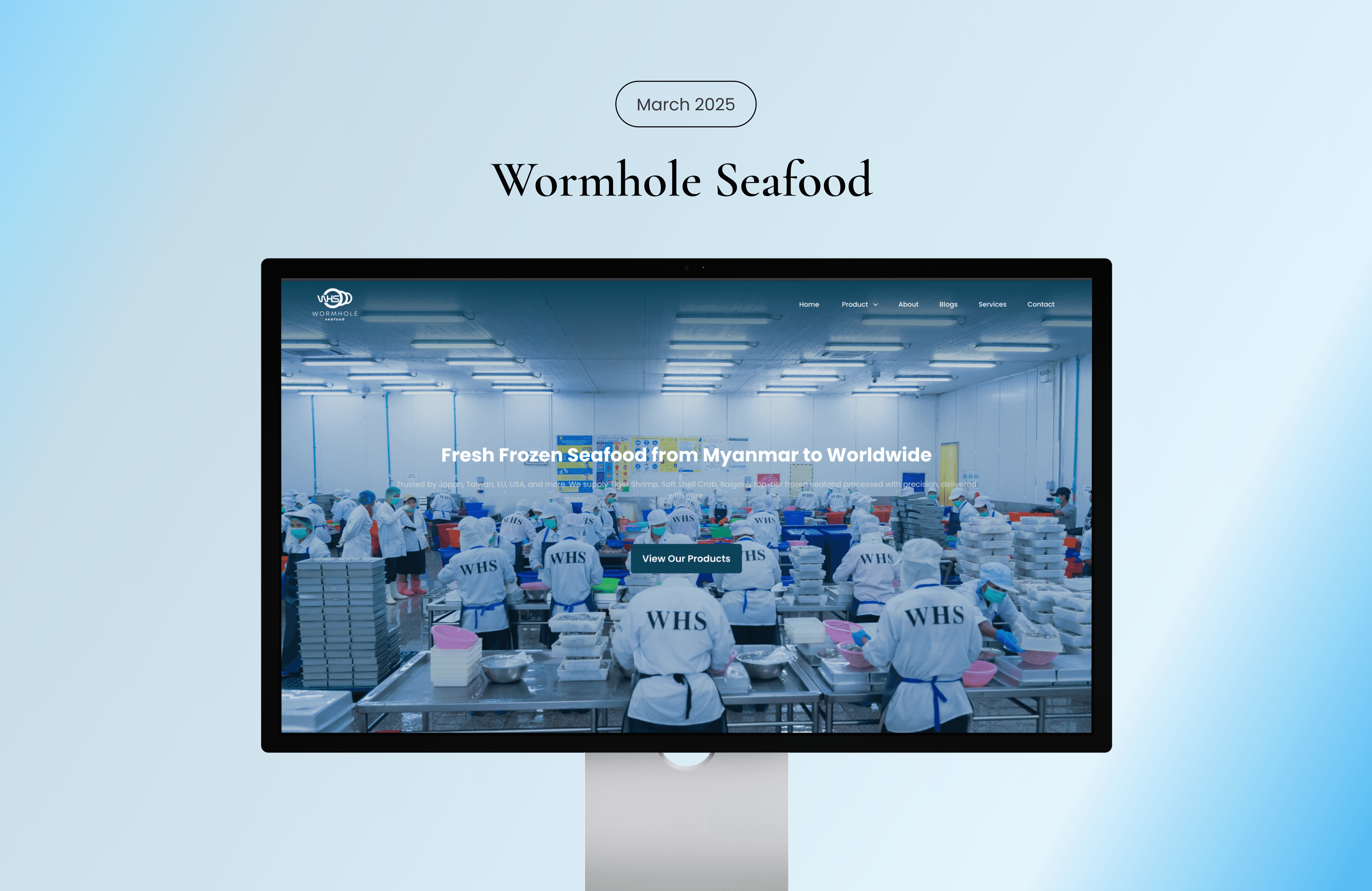
Branding
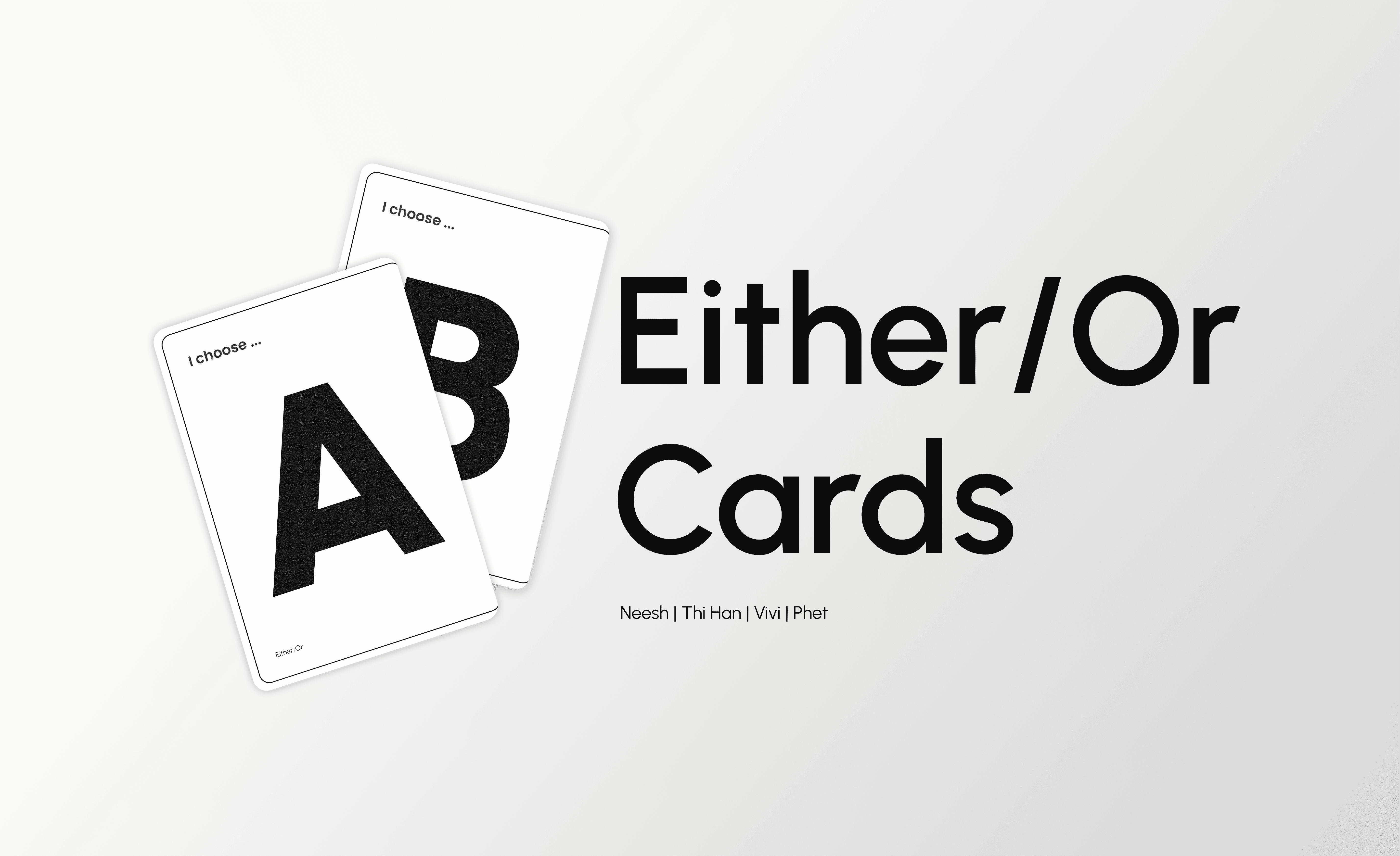
Either / Or Card
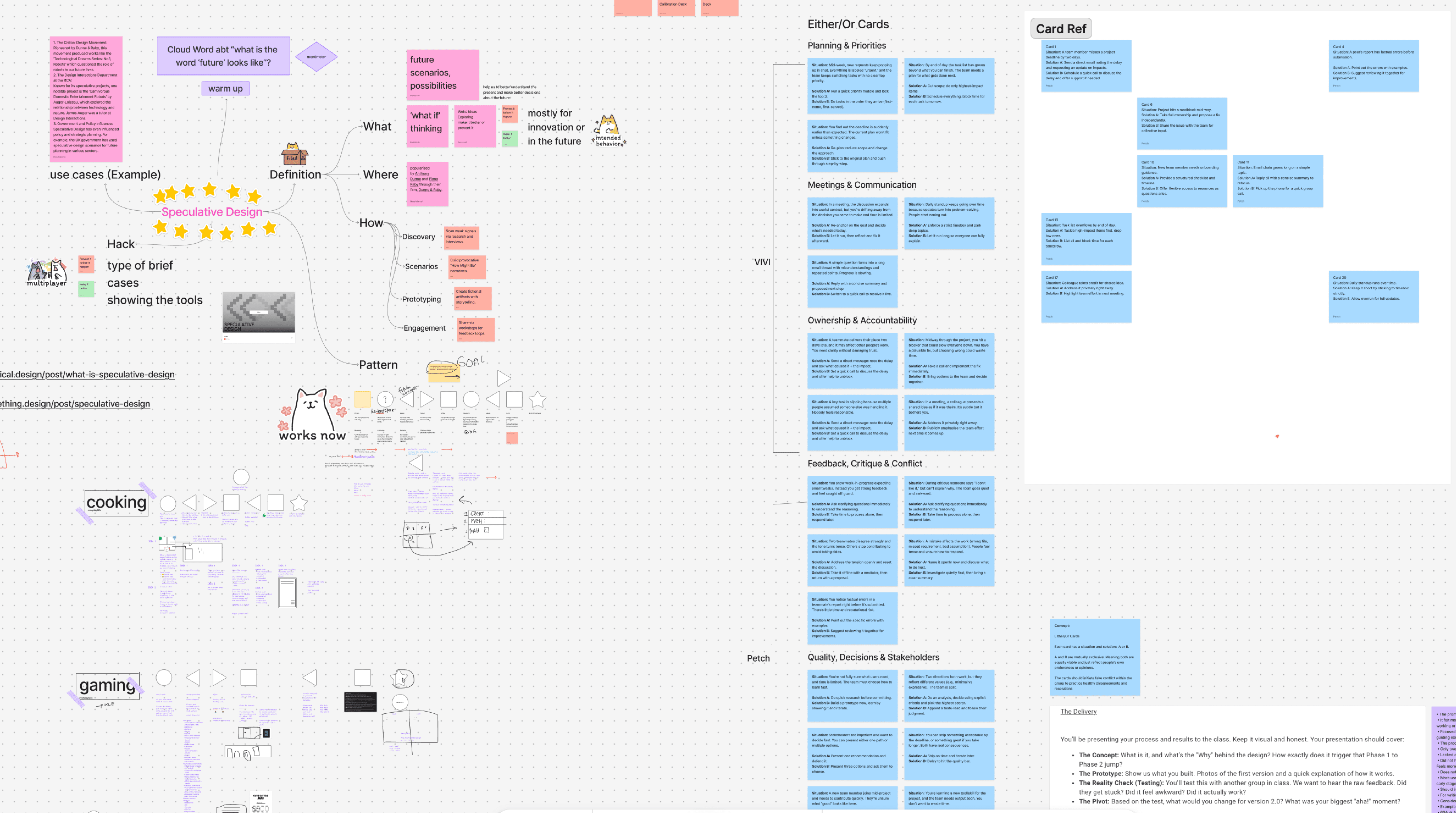
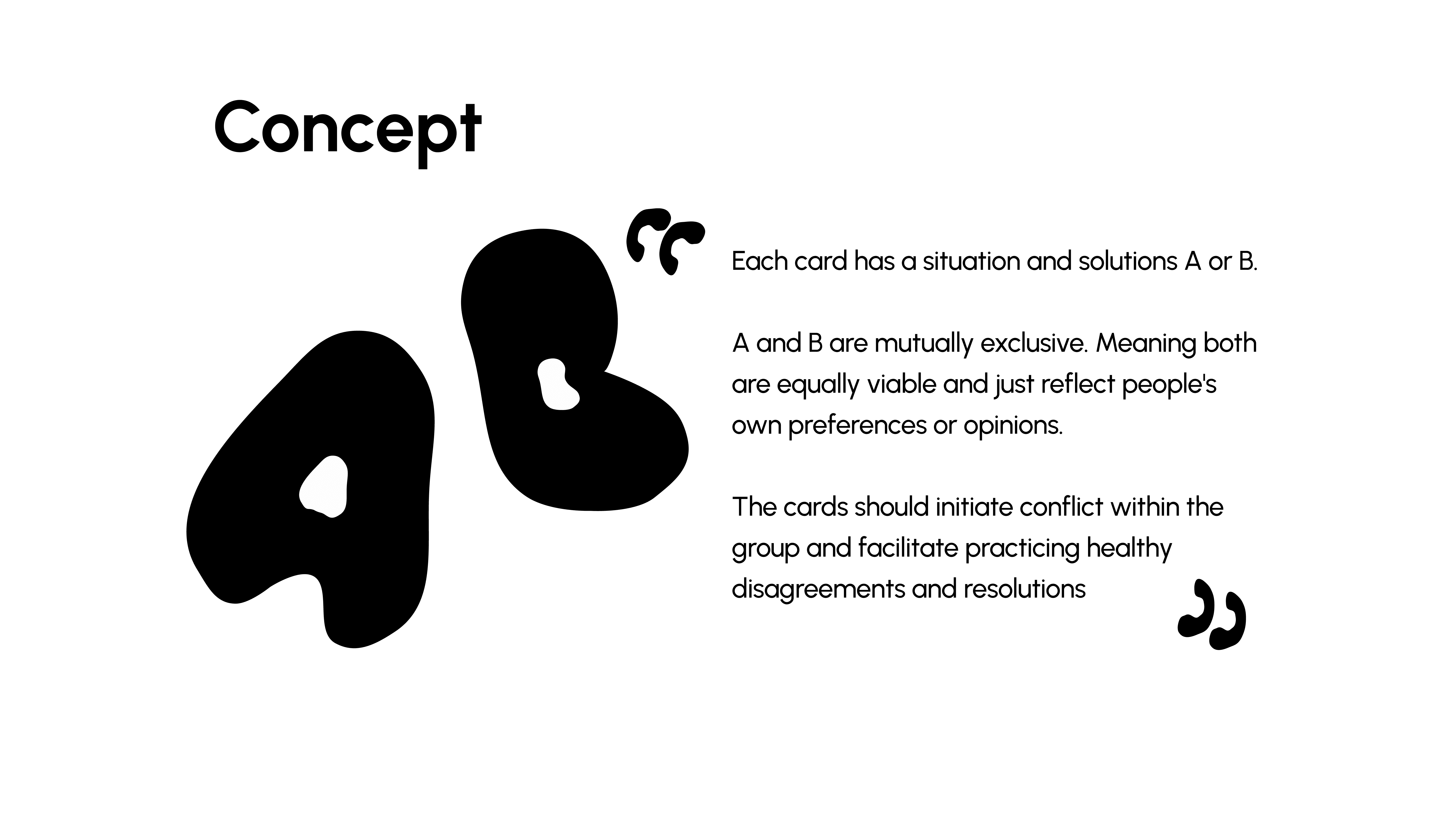
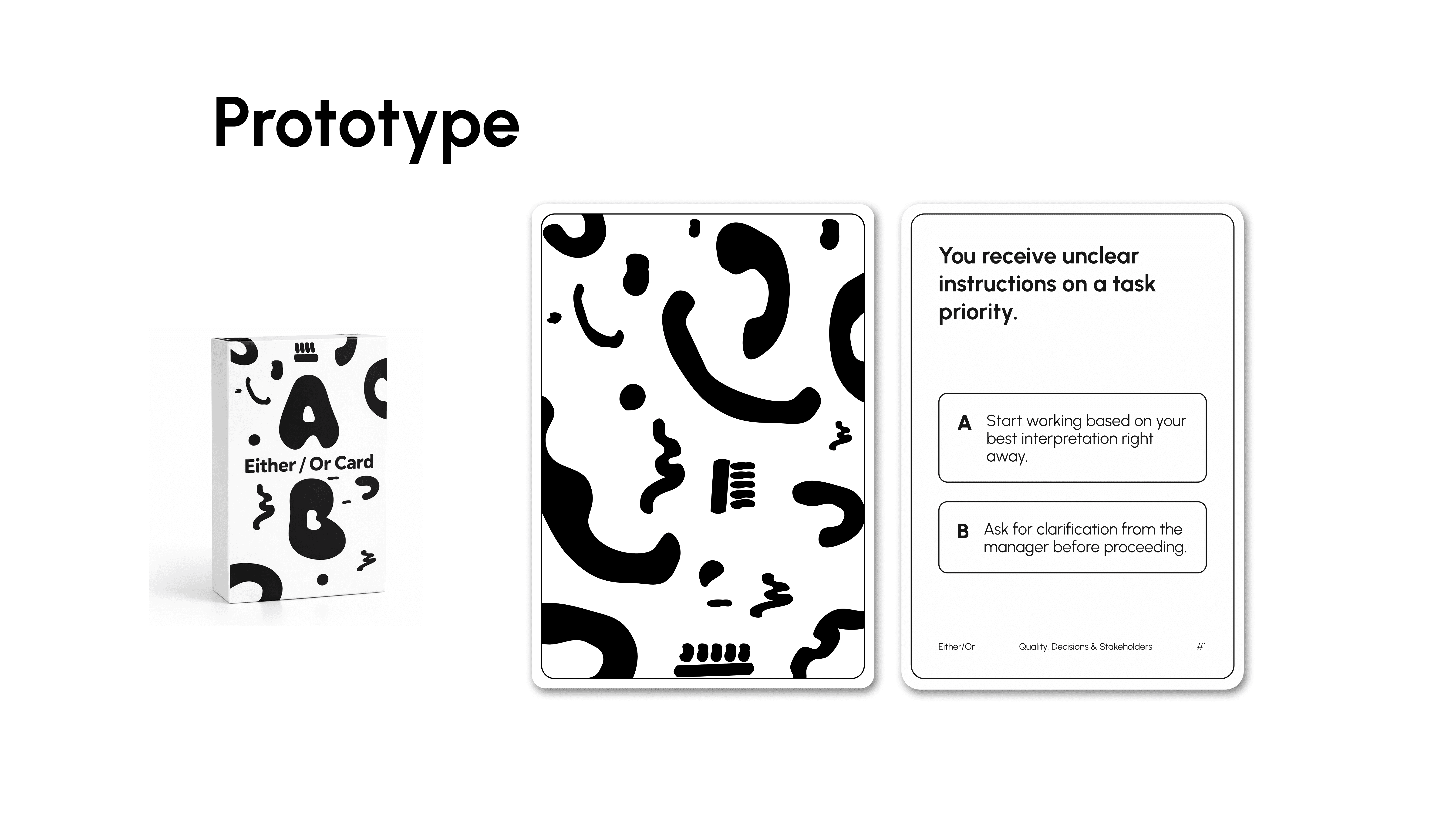
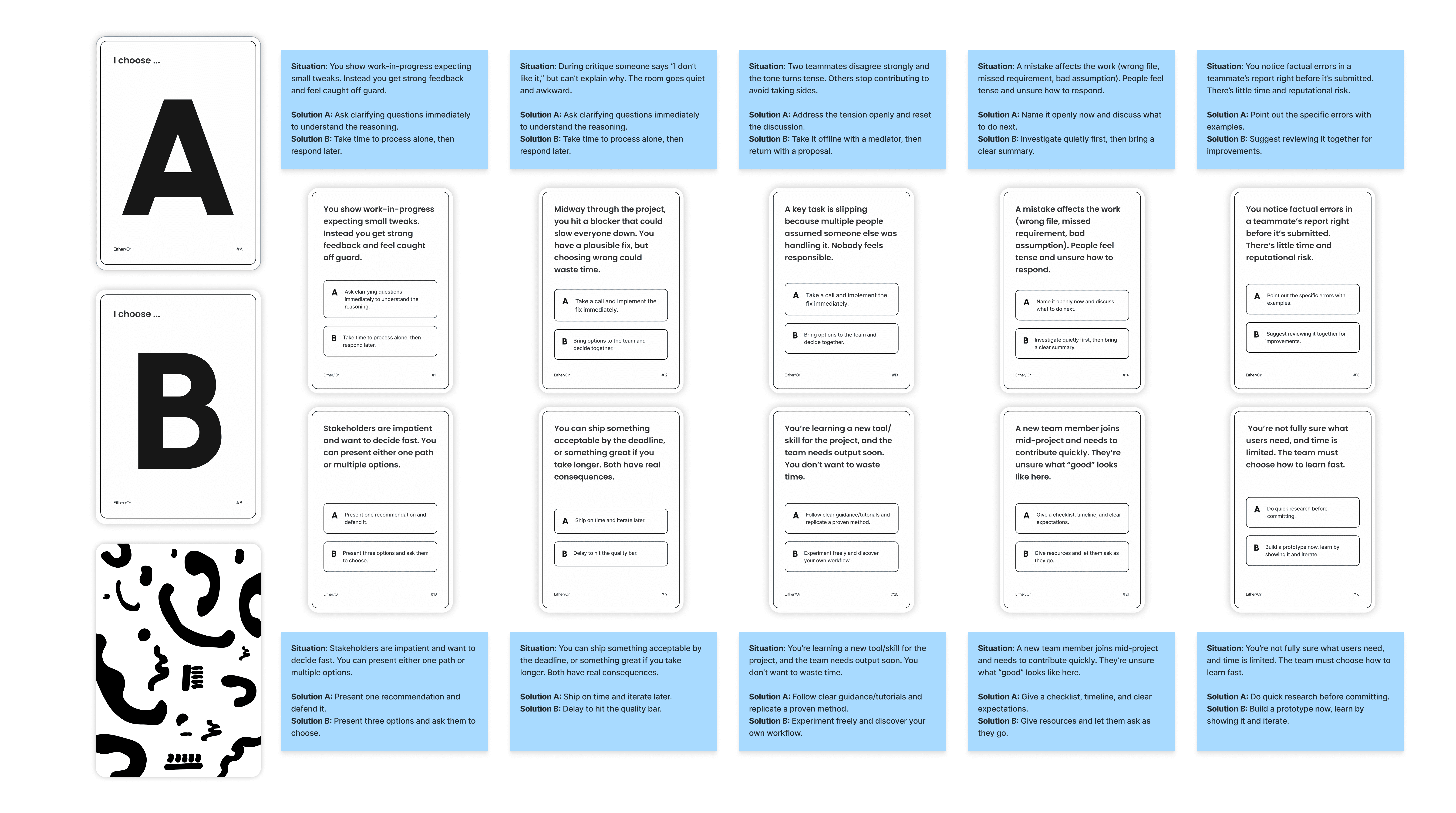
This is a team-based decision-making card tool designed to spark constructive conflict and encourage healthy disagreement. Each card presents a real-world situation with two possible solutions: Option A or Option B. Both options are equally valid but mutually exclusive, reflecting different perspectives, preferences, and thinking styles. The goal is not to find a “correct” answer, but to understand how team members think, debate respectfully, and reach alignment through discussion.
Year :
2026
Industry :
Education
Project Duration :
3 weeks
Problem :
Teams often struggle with avoiding conflict, allowing dominant voices to shape decisions, or failing to fully understand diverse perspectives. Discussions may lack structure, clear objectives, and documentation, causing valuable insights to be lost.
Initial testing revealed several weaknesses:
Some scenarios were too obvious and failed to spark real debate
Certain situations lacked sufficient context
There was no clear objective or conclusion
No incentive existed to encourage deeper disagreement
Personal preferences were shared but not analyzed
Participants could be influenced by others’ choices
This reduced the overall impact of the exercise.
Solution :
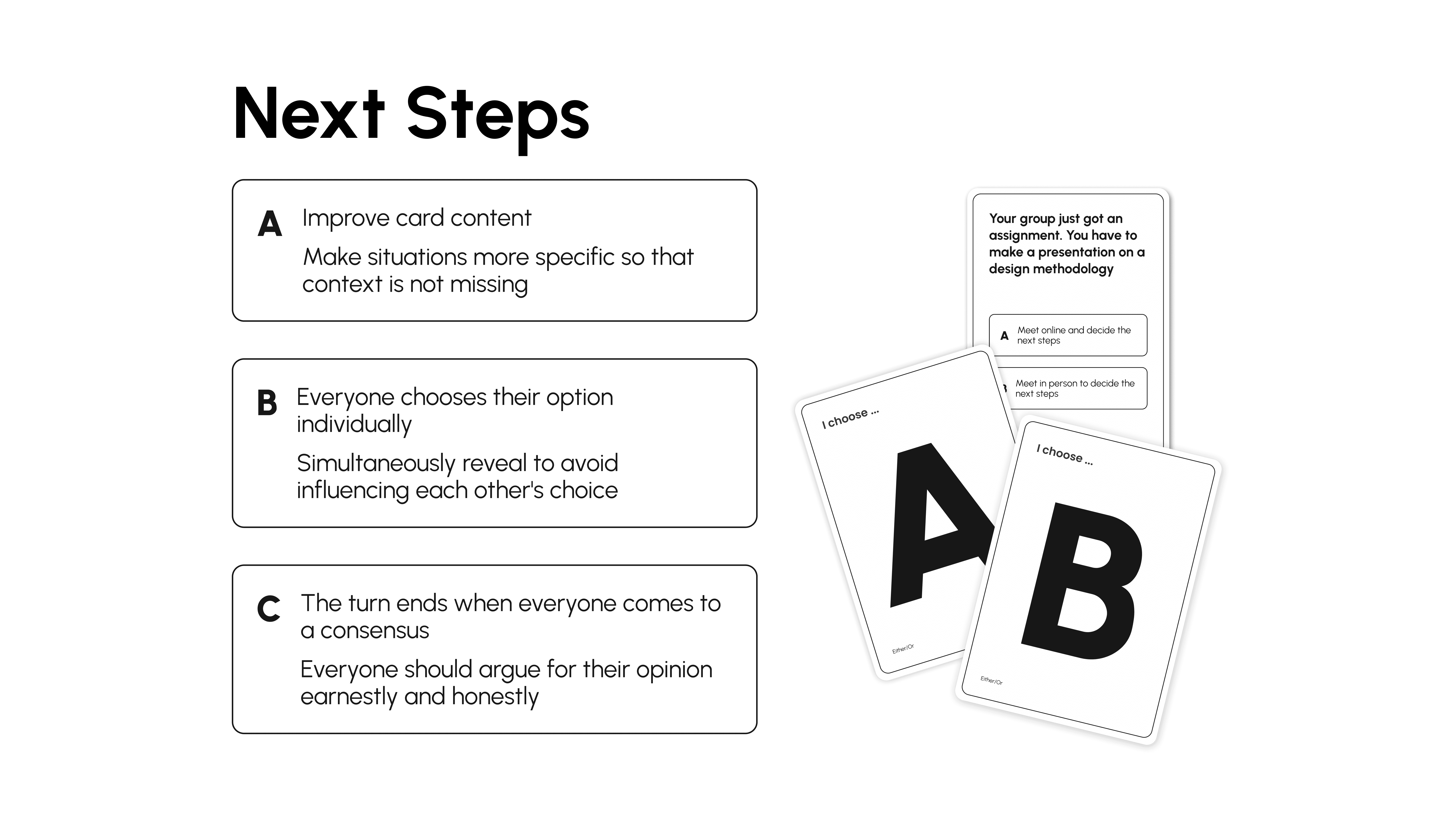
The tool was redesigned to create a more structured and meaningful discussion process.
Enhancements included:
Making scenarios more specific and context-driven
Allowing individuals to choose independently
Revealing choices simultaneously to prevent bias
Requiring consensus before ending each round
Encouraging participants to defend their decisions sincerely
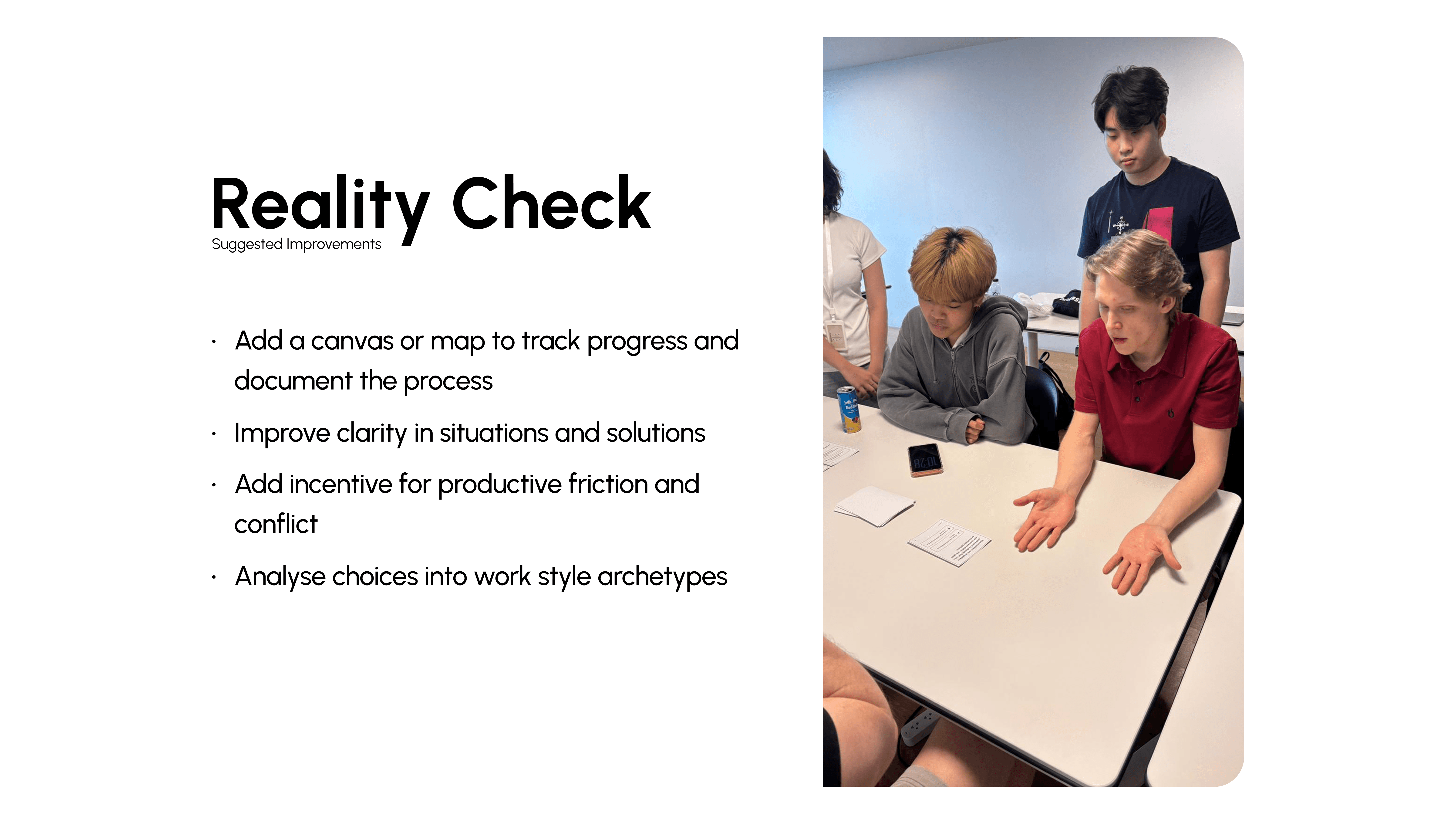
To strengthen long-term value, a visual canvas was introduced to document decisions, track progress, and analyze patterns into work-style archetypes.
This transforms casual conversation into a purposeful team-alignment activity.
Challenge :
Designing two equally strong options without making one clearly superior required careful balancing.
Another challenge was minimizing peer influence during decision-making. Implementing simultaneous reveal helped preserve independent thought.
Additionally, the absence of a defined outcome initially made discussions feel incomplete. Establishing a consensus-based ending created clearer structure and closure.
Visual Direction :
The visual identity is inspired by structured working patterns such as circles, squares, and stars. The primary form avoids sharp edges and leans toward a circular, abstract shape.
Although it resembles a circle, it is intentionally imperfect, symbolizing that each team member brings unique ideas and perspectives.
The design communicates openness, equality, and continuous dialogue — reinforcing the core principle that diverse thinking strengthens collaboration.
More Projects

Branding
Either / Or Card
This is a team-based decision-making card tool designed to spark constructive conflict and encourage healthy disagreement. Each card presents a real-world situation with two possible solutions: Option A or Option B. Both options are equally valid but mutually exclusive, reflecting different perspectives, preferences, and thinking styles. The goal is not to find a “correct” answer, but to understand how team members think, debate respectfully, and reach alignment through discussion.
Year :
2026
Industry :
Education
Project Duration :
3 weeks
Problem :
Teams often struggle with avoiding conflict, allowing dominant voices to shape decisions, or failing to fully understand diverse perspectives. Discussions may lack structure, clear objectives, and documentation, causing valuable insights to be lost.
Initial testing revealed several weaknesses:
Some scenarios were too obvious and failed to spark real debate
Certain situations lacked sufficient context
There was no clear objective or conclusion
No incentive existed to encourage deeper disagreement
Personal preferences were shared but not analyzed
Participants could be influenced by others’ choices
This reduced the overall impact of the exercise.
Solution :
The tool was redesigned to create a more structured and meaningful discussion process.
Enhancements included:
Making scenarios more specific and context-driven
Allowing individuals to choose independently
Revealing choices simultaneously to prevent bias
Requiring consensus before ending each round
Encouraging participants to defend their decisions sincerely
To strengthen long-term value, a visual canvas was introduced to document decisions, track progress, and analyze patterns into work-style archetypes.
This transforms casual conversation into a purposeful team-alignment activity.
Challenge :
Designing two equally strong options without making one clearly superior required careful balancing.
Another challenge was minimizing peer influence during decision-making. Implementing simultaneous reveal helped preserve independent thought.
Additionally, the absence of a defined outcome initially made discussions feel incomplete. Establishing a consensus-based ending created clearer structure and closure.
Visual Direction :
The visual identity is inspired by structured working patterns such as circles, squares, and stars. The primary form avoids sharp edges and leans toward a circular, abstract shape.
Although it resembles a circle, it is intentionally imperfect, symbolizing that each team member brings unique ideas and perspectives.
The design communicates openness, equality, and continuous dialogue — reinforcing the core principle that diverse thinking strengthens collaboration.
More Projects
Branding
Either / Or Card
This is a team-based decision-making card tool designed to spark constructive conflict and encourage healthy disagreement. Each card presents a real-world situation with two possible solutions: Option A or Option B. Both options are equally valid but mutually exclusive, reflecting different perspectives, preferences, and thinking styles. The goal is not to find a “correct” answer, but to understand how team members think, debate respectfully, and reach alignment through discussion.
Year :
2026
Industry :
Education
Project Duration :
3 weeks
Problem :
Teams often struggle with avoiding conflict, allowing dominant voices to shape decisions, or failing to fully understand diverse perspectives. Discussions may lack structure, clear objectives, and documentation, causing valuable insights to be lost.
Initial testing revealed several weaknesses:
Some scenarios were too obvious and failed to spark real debate
Certain situations lacked sufficient context
There was no clear objective or conclusion
No incentive existed to encourage deeper disagreement
Personal preferences were shared but not analyzed
Participants could be influenced by others’ choices
This reduced the overall impact of the exercise.
Solution :
The tool was redesigned to create a more structured and meaningful discussion process.
Enhancements included:
Making scenarios more specific and context-driven
Allowing individuals to choose independently
Revealing choices simultaneously to prevent bias
Requiring consensus before ending each round
Encouraging participants to defend their decisions sincerely
To strengthen long-term value, a visual canvas was introduced to document decisions, track progress, and analyze patterns into work-style archetypes.
This transforms casual conversation into a purposeful team-alignment activity.
Challenge :
Designing two equally strong options without making one clearly superior required careful balancing.
Another challenge was minimizing peer influence during decision-making. Implementing simultaneous reveal helped preserve independent thought.
Additionally, the absence of a defined outcome initially made discussions feel incomplete. Establishing a consensus-based ending created clearer structure and closure.
Visual Direction :
The visual identity is inspired by structured working patterns such as circles, squares, and stars. The primary form avoids sharp edges and leans toward a circular, abstract shape.
Although it resembles a circle, it is intentionally imperfect, symbolizing that each team member brings unique ideas and perspectives.
The design communicates openness, equality, and continuous dialogue — reinforcing the core principle that diverse thinking strengthens collaboration.